

Pretty Blue Colors to Make With Acrylic Paint
Limiting your palette to a handful of colours can help to achieve harmonious colour mixes and set a key for your painting. Following on from our exploration into the five yellows of the Jackson's Artist Acrylic range, here is a look at the eight blues, presented within suggested restricted palettes. Although I have used Jackson's Artist Acrylics for this article, pigment characteristics are very similar across all brands, and so the information here is not brand specific. I have also compared Cerulean Blue Hue with Cerulean Blue Genuine, and Cobalt Blue Hue with Cobalt Blue Genuine, and found that the differences between the genuine pigment and the blended alternative is smaller than you might expect.

The Jackson's Artist Acrylic range has seven blues in it. They are:

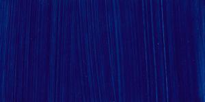
Phthalo Blue Red Shade

Phthalo Blue Green Shade

French Ultramarine

Cobalt Blue Genuine

Cobalt Blue Hue

Cerulean Blue Genuine

Cerulean Blue Hue

Turquoise
This article looks at the characteristics of these blues and offers suggestions of what restricted palettes you might include them in.
How I have selected my palettes
In the post about the yellows and how to mix them, I suggested how you might go about selecting a restricted palette. For the blues I have followed the principles described there; identifying whether each blue has a red or green bias, and then balancing this out with the other colours. For example, if a blue has a green bias, I am likely to select a red with a blue bias, and then decide whether I want a cooler palette by using a yellow with a green bias, or a warmer palette by using a yellow with an orange bias.
Essentially what I am doing is selecting colours that are relatively evenly spaced around the colour wheel. By doing this I am ensuring that I can mix a wide range of harmonious colours. In contrast, were you to choose colours close together on the wheel, you could still achieve a harmonious palette, but the ability to mix a wide range of colours would be compromised.
Phthalo Blue Red Shade
Pigment: PB15:1 Alpha Copper Phthalocyanine

Phthalo Blue Red Shade appears a deep intense blue when squeezed from the tube. It is semi-transparent and highly staining. As you add water the strength of the colour is maintained; a very dilute mix can be useful when painting skies.

When I added small amounts of white to the Phthalo Blue Red Shade the high staining capacity demonstrated how many shades of blue you could mix. As a result it's clear that a wide tonal range can be achieved with this colour.
My chosen palette: Phthalo Blue Red Shade, Black, Cadmium Orange Genuine, Venetian Red

Black

Cadmium Orange Genuine
Phthalo Blue Red Shade

Venetian Red
While researching Phthalo Blue on Handprint.com, I found the following statement: The best mixing complements for Phthalo Blue, depending on hue, are Venetian Red or Cadmium Orange. I wanted to put this to the test by having Venetian Red and Cadmium Orange Genuine in my palette, and then added Black – which has a warm undertone. My palette therefore consisted of one very strong warm blue, and 3 strong warm colours across the spectrum.
My test
Responding to feedback on my previous post, I decided to paint a chart to show what the mixes I created are made of. However I didn't want to only make a chart, as I find it is very difficult to illustrate the wide range of nuanced shades that a four colour palette such as this one can create; sometimes with varying proportions of all 4 colours plus white. Therefore around the chart are the results of mixing a variety of colours and tones using the restricted palette, as I feel that mixing in this less structured way delivers results that can more easily be imagined as the colours of a finished painting. Needless to say, were you to try mixing your own colours they will invariably turn out differently as you can mix the colours in an endless array of combinations and ratios; this is simply to illustrate the potential of the palette.

Results
This is a really warm earthy palette with the capacity to mix a wide variety of greys, both warm and cool. The orange mixes with white to create a pinky-peach, and the Venetian Red also makes a beautiful soft earthy pink. The orange combines with the blue to make a dark mustard colour, and another of the strong mixes with the brick red made by mixing the red and orange. I can imagine this palette would work brilliantly in a dusky landscape painting, or a still life in low light. It has real subtlety and strength.
Phthalo Blue Green Shade
Pigment: PB15:3 Beta Copper Phthalocyanine

Phthalo Blue is very similar to Phthalo Blue Red Shade. It is intense and deep when squeezed from the tube, with a green undertone. Like the Red Shade, it maintains its colour strength when diluted right to the end, and also does so when mixed with white. As a result you can achieve a wide range of tones with the colour.

My chosen palette: Phthalo Blue GS, Cadmium Yellow Deep Genuine, Napthol Red, Paynes Grey

Cadmium Yellow Deep Genuine

Napthol Red

Payne's Grey

Phthalo Blue Green Shade
To contrast my palette for Phthalo Blue Red Shade, I decided to include a strong yellow, and Cadmium Yellow Deep Genuine was my chosen one. It has the hue of a very deep custard, and I felt it would mix some lovely oranges with Napthol Red. This is a deep crimson colour that is a cross between Magenta and Alizarin Crimson. When mixed with white it creates a lovely purple-pink. I opted for Payne's Grey instead of Black this time as I was interested in the blue-red bias Payne's Grey has, which I felt would go well with the Napthol Red and the Phthalo Blue. I was looking forward to seeing the greens achieved with the Cadmium Yellow and Phthalo Blue Green Shade.

Results
This is my kind of palette! I love Napthol Red and its versatility, and this palette demonstrates its ability to mix beautiful warm oranges and terracottas. The Payne's Grey and red create a beautiful and very useful deep violet, ideal for shadows. The Phthalo Blue and Grey work so well beside one another, offering the potential for a wide variety of grey-blues. The greens achievable with the blue and yellow are naturalistic and olive-like, and can be modified further by adding small quantities of Payne's Grey. All in all a really versatile palette for any subject matter.
French Ultramarine
Pigment: PB29 Sodium Aluminum Sulfosilicate

French Ultramarine is a deep intense violet blue as it is squeezed from the tube. However you can see that its staining capacity is much less than the Phthalos; as more and more water is added it quickly fades out. It is semi-transparent and is known to mix well with Raw Umber; for this reason I decided to include this in my palette.

The strip above shows French Ultramarine mixed with increasing amounts of Titanium White. It has a slightly narrower tonal range than the Phthalo Blues, and as it becomes whiter it also loses the red bias that the colour has from the tube. As more white is mixed into it, it becomes more grey-blue.
My chosen palette: French Ultramarine, Lemon Yellow, Orange/Red, Raw Umber

French Ultramarine
Lemon Yellow

Orange/Red

Raw Umber
French Ultramarine is a highly popular blue and often appears in starter paint sets. I wanted my palette to comprise colours that you might find in a starter set, to show the kinds of mixes you can get from a largely primarypalette. The blue has a red-violet bias, so I chose an acidic yellow to contrast that, in the form of Lemon Yellow. Mid-way between these two colours would be an orangey red, so I chose Orange/Red! And then finally I had Raw Umber there as I wanted to see how it mixed with the French Ultramarine.

Results
A primary palette with some very high chroma mixes! However it also has the potential to mix some very gentle, muted beiges, greys and dusty greens by adding white and Raw Umber. I particularly like the greens in this palette; French Ultramarine and Lemon Yellow mix a really useful leaf green! The dark blue black achieved by mixing blue and Raw Umber is intense and frankly, sumptuous. Complementing all of these are some warm and rich browns, golds and rusty-oranges. Another palette that could be used for any kind of subject matter – the possibilities are limitless.
Cobalt Blue Genuine
Pigment: PB28 Cobalt Aluminium Oxide
and
Cobalt Blue Hue
Pigment: PB29 PB15:3 PW6 PR112 PR122

The differences and similarities between Cobalt Blue Genuine (right) and Cobalt Blue Hue as seen from the tube. Cobalt Blue Hue is noticeably more opaque, lighter and slightly chalkier looking than the transparent, slightly more red Cobalt Blue Genuine.

Cobalt Blue is a moderately staining, semi-opaque mid tone blue. When diluted with water it maintained more of its colour than French Ultramarine, but less than the Phthalos. For this section I'm going to make a direct comparison with Cobalt Blue Hue as I go, as I want to show the differences and similarities between Cobalt Blue Genuine and Cobalt Blue Hue. Below is how Cobalt Blue Hue looks when diluted out.

From the tube, Cobalt Blue Hue was marginally paler than Cobalt Blue Genuine, with a less red undertone, and significantly more opaque, and perhaps slightly chalkier looking. It appeared stronger as it was diluted out.
Here's the Cobalt Blue Genuine when white is added it to it:

And Cobalt Blue Hue when white is added to it:

The two strips above are more similar than I would have predicted, given the number of pigments blended in the second strip, and the single pigment in the first. The colour is a little stronger and more opaque in the second strip, as might be expected, however it has apureand clean appearance and is far from dull. That said, the Cobalt Blue Genuine is more nuanced and easier to control in terms of tonal variation, and has that degree of transparency which adds to its beauty. And these are the qualities that a single pigment colour can offer.
My chosen palette: Cobalt Blue Genuine, Raw Umber, Cadmium Red Deep, Yellow Ochre
Cobalt Blue Genuine
Raw Umber

Cadmium Red Deep
Yellow Ochre
To keep the comparison between Cobalt Blue Genuine and Cobalt Blue Hue going, I decided to mix the two blues in the same restricted palette, consisting of Raw Umber, Cadmium Red Deep and Yellow Ochre. Again, it's another fairly primary palette, the biases of the blue, red and yellow are not overt, so there will be plenty of scope for a wide range of colours. I wanted to see what transparent darks could be achieved by adding Raw Umber. And of course, I was interested to see what differences I could see between the Cobalt Blue Genuine and Cobalt Blue Hue in colour mixes. Here are my results:

Cobalt Blue Genuine colour mixes

Cobalt Blue Hue colour mixes
Results
The differences between the two Cobalt Blues will no doubt become more apparent when the colour is thinned out, where the Cobalt Blue Genuine has the opportunity to show its transparency and colour strength. But in these tests using the paint fairly thickly, the differences are slight, and especially so when using genuine pigments in the rest of the palette. Regardless of which Cobalt you might use, this is a high chroma yet naturalistic palette, which plenty of scope for earthy ochres, greens and greys to support the bright red and blue. I imagine this could be a great palette for a summer garden or flower painting, or a portrait, depending on how you mix the colours.
Cerulean Blue Genuine
Pigment: PB36 Cobalt Chromium Oxide
and
Cerulean Blue Hue
Pigment: PB29 PW6 PB15:3 PY3

Cerulean Blue Genuine and Cerulean Blue Hue as they appear when squeezed from the tube. The differences are more subtle here than with the Cobalts. Cerulean Blue Hue (right) is slightly more red and fractionally less chalky looking, but they both appear to have the same opacity. Note than some of the binder has separated out in the Cerulean Blue Genuine – this happens occasionally, usually with coarser pigments, such as Cerulean. It can be remedied by stirring the inside of the tube with a straightened paper clip.
 Above is Cerulean Blue gradually diluted with water. From the tube it is a mid tone, moderate staining, cool blue. As water is added to it it becomes a useful sky colour. You can see the granulation of the pigment as it is diluted – the slightly powdery texture.

Above is the Cerulean Blue Hue gradually diluted. It has less noticeable granulation. You can see more clearly in these strips that the colour is brighter and more red than the genuine pigment. As it dilutes it actually gives more even colour. For those getting to grips with painting, I imagine Cerulean Blue Hue may be easier to paint with for these reasons.
Below is Cerulean Blue Genuine as it appears when small quantities of white are gradually added to it:

And here is Cerulean Blue Hue as it appears when small quantities of white are gradually added to it:

Cerulean Blue Hue is more domineering than the Genuine Cerulean, as you can see adding white to it has less impact than it does with the genuine pigment. It was much easier to achieve subtle variations of tone with Genuine Cerulean, as you can see from the evenly spaced gradations of tone. The red bias of Cerulean Blue Hue fades as more white is added to it, so when you get to the paler mixes, there's very little difference in appearance between the pale Cerulean Blue Hue and the pale Cerulean Genuine.
My chosen palette: Cerulean Blue Genuine, Burnt Sienna, Cadmium Yellow Medium Hue, Payne's Grey
Cerulean Genuine

Burnt Sienna

Cadmium Yellow Medium Hue
Payne's Grey
Again, I used the same restricted palette of colours for both Cerulean Genuine and Cerulean Blue Hue, in order to make a comparison. Cerulean is often used in landscape painting, so I felt it would be appropriate to add Burnt Sienna for its rich earthiness, and then Cadmium Yellow Medium Hue for a bit of sun! Payne's Grey was my chosen dark because I felt it would be more useful than Black for mixing greens and dark blue greys. Here are my results:

Cerulean Genuine colour mixes

Cerulean Blue Hue colour mixes
Results
At first I couldn't tell the difference, but on closer inspection I can see the greater degree of transparency found in Cerulean Genuine has a noticeable impact upon the test results. The colour mixes are more transparent and more subtle, and in the long run would be easier to control and offer more versatility when painting a picture. Cerulean Genuine has a depth than Cerulean Blue Hue lacks; The opacity of Cerulean Blue Hue makes it look a lot flatter. That said, were you to look at these separately, would you be able to really tell any difference? It's hard to say. Both Ceruleans offer the potential to create beautiful greys and greens in particular, which are complemented by the earthy pinks and terracottas that the rest of the palette is capable of. This palette evokes rolling Dorset hills to me; definitely a summer palette of colour.
Turquoise
Pigment: PB15.3 PG7 PW6

The pigment codes tell us that Jackson's Artist Acrylic Turquoise is composed of PW6 Titanium White, PG7 Phthalocyanine Green and PB15:3 Phthalo Blue Green Shade. Therefore I can deduce that the paint will have some of the characteristics that these pigments offer. Titanium white is opaque and strong – the white often used for highlights, and we know the Phthalos have a reputation for being high staining, powerful transparent colours. So when this Turquoise was squeezed from the tube and gradually diluted, its staining capacity and the strength of the colour as more and more water was added was no surprise. The opacity is of course the influence of the Titanium. Some turquoises are very much a straight-down-the-line combination of green and blue, but I would say this Turquoise is definitely more blue than green.
Here's how it looked when mixing with increasing amounts of white:

Forgive me, it appears the tiniest amount of a rogue pigment crept in in the most white squares! But still, it gives a general idea. The colour is just as strong when white is added and creates some fresh minty hues. Evocative of the Meditteranean!
My chosen palette: Turquoise, Cadmium Red Genuine, Cadmium Yellow Deep Genuine, Payne's Grey
Turquoise

Cadmium Red Genuine
Cadmium Yellow Deep Genuine
Payne's Grey
Another jolly palette to end my tests! The Cadmium Red is a very primary red, with no obvious bias to either orange or violet, while Cadmium Yellow Deep Genuine is that delicious custard hue, moving towards an orange-yellow. Payne's Grey is back again, I love how it has mixed with the other blues and I'm curious to see the Turquoise/Payne's Grey mix.

Results
Looking at the chart top left, you can see clearly the vast array of high chroma mixes, but also wide range in tonal values that can be achieved with very simple two colour blends, with this palette. The orange made with the red and yellow acts as a complementary to the straight Turquoise, and offers another really bright colour to harmonise with the yellow, red and turquoise. Supporting all these bursts of brightness are some rich reds and browns, and vibrant naturalistic greens. When more white is added to Payne's Grey and Cadmium Red mixes you introduce a delicate pale violet-grey. Another palette with all manner of potential, I can't suggest a particular subject as it could be used for anything!
Conclusion
These eight blues are varied and full of potential. My suggested restricted palettes are simply suggestions to demonstrate the array of colours you can mix with just 4 or 5 tubes at a time. Sitting down to mix with a handful of colours is hugely beneficial to one's understanding of how pigments behave. So if you have an afternoon set aside to paint but feel a little uninspired just mixing for the sake of it can further your understanding of how colours behave, and it might just kick start a few creative ideas as well. I strongly recommend investing in a palette knife for mixing as it helps to keep colours clean and un-muddied. Whether your aim is to paint the colours you see, or be led creatively by the colours that appeal to you, a restricted palette can help keep your work looking fresh, vibrant and harmonious.
Browse acrylic paints at Jacksonsart.com
Pretty Blue Colors to Make With Acrylic Paint
Source: https://www.jacksonsart.com/blog/2020/07/13/eight-blues-in-eight-limited-palettes/
0 Response to "Pretty Blue Colors to Make With Acrylic Paint"
Post a Comment